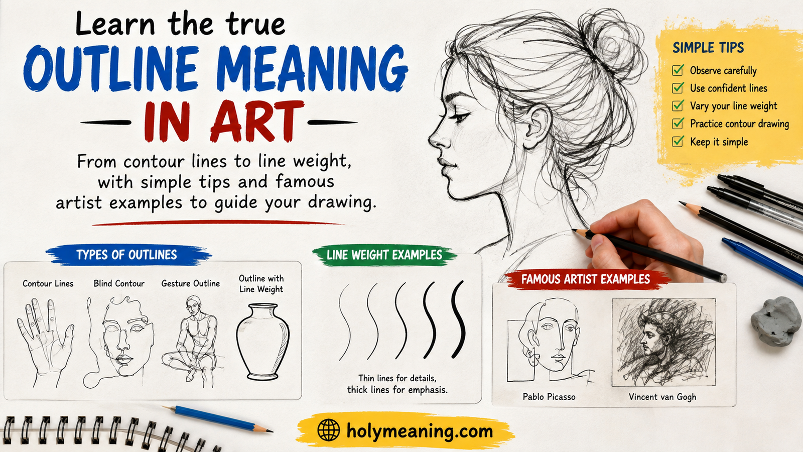
Outline meaning in art refers to the deliberate use of a continuous line to define the outer edge of a form, separating it from the background or nearby objects. It’s a conscious artistic choice, not just a shape’s natural boundary.
Here’s the twist: some of the most powerful art ever made lives entirely in that single decision. A bold line can turn a comic panel into a punch to the gut. A vanished one can turn a portrait into a whisper.
From Hokusai’s carved woodblocks to Lichtenstein’s comic-inspired canvases, outline has shaped how artists communicate emotion, depth, and clarity for centuries. Master it, and your line work stops describing objects. It starts making decisions.
What Is Outline in Art? A Definition That Actually Holds Up
Here’s the short version: an outline is a continuous line that traces the outer edge of a form, separating it from the background or from other objects around it. That’s the working outline definition you’ll find in most art textbooks, and it’s accurate as far as it goes.
But here’s where most explanations stop too early. Every object you draw has an edge, technically speaking. That edge exists whether you draw it or not. The moment you decide to render that edge as a visible, deliberate line, you’ve made an artistic choice. That choice is what separates a descriptive edge (something that simply exists) from an outline (something an artist decided to show).
Think about a photograph of an apple. The apple has an edge where it meets the table behind it. A camera doesn’t draw a line there; it just captures a shift in color and light. A cartoonist drawing that same apple, on the other hand, will almost always add a bold, continuous line around the fruit. Same object, same edge, two completely different visual results.
A useful way to think about it: outline drawing isn’t about copying reality. It’s about deciding how much of reality to show, and how boldly to show it.
Outline as One of the Elements of Art
If you’ve taken an art class, you’ve probably heard of the elements of art: line, shape, form, space, value, color, and texture. Outline isn’t technically its own element on that list — it’s a specific use of the line element. But most art teachers treat it almost like an eighth element anyway, and for good reason. It shows up constantly, in nearly every drawing discipline, from your first day sketching in a notebook to advanced illustration work decades later.
Here’s how outline connects to the broader art elements most curricula teach:
| Element of Art | How Outline Relates to It |
|---|---|
| Line | Outline is a specific application of line — a continuous mark defining an edge |
| Shape | Outline is often what creates a recognizable shape in the first place |
| Form | 3D form can be suggested through outline plus shading, or through outline alone in flat styles |
| Space | Outline placement and weight can push objects forward or backward in a composition |
| Value | Outline sometimes replaces value shifts entirely, especially in flat illustration and comics |
So when someone asks about outline meaning in art, the honest answer is that it sits at the intersection of several elements at once. It’s rarely used in isolation, even when it looks simple on the surface.
Outline vs. Contour Line — Ending the Confusion for Good
This is probably the single most searched question on the topic, and it’s also the one most articles get wrong or oversimplify. Outline and contour line are related, but they are not the same thing, and mixing them up will hold your drawing skills back.
An outline describes only the outer silhouette of a form. Draw an apple as an outline, and you’ll end up with a rounded shape, maybe with a small stem poking out the top. It tells you the object’s overall proportions, but nothing about what’s happening on its surface.
A contour drawing, on the other hand, describes both the outer edge and the internal structure — every fold, dimple, ridge, and change in plane. Go back to that same apple. A true contour drawing would show the small dent where the stem meets the fruit, the subtle curve where the apple bulges outward, maybe even the faint lines where the skin puckers near the base. It’s a far more detailed, far more observational way of drawing.
Quick comparison:
- Outline = outer edge only, fast, simplified, often stylized
- Interior contour = internal edges and plane changes included
- Contour drawing (full) = outer edge + interior contour combined, slow, highly observational
Blind Contour Drawing — the Exercise That Changes Everything
If you’ve ever taken a foundational drawing class, chances are your very first assignment involved blind contour drawing. The rules are simple and a little terrifying the first time you try them: look only at the object you’re drawing, never at your paper, and move your pencil at the same slow speed your eyes travel across the edges of the form.
The results are usually messy. Proportions go sideways. Lines don’t connect where you expect them to. That’s the point. Blind contour drawing isn’t about producing a good final image — it’s about breaking a habit almost every beginner has, which is drawing what you know an object looks like instead of what’s actually in front of you.
This exercise gets credit largely because of Betty Edwards’ influential book Drawing on the Right Side of the Brain, which popularized contour drawing as a way to shift the brain out of symbolic, shortcut-based thinking and into genuine observation. If you’ve never tried it, set a timer for five minutes and draw your own hand without looking down once. It’s humbling, and it’s one of the fastest ways to improve your sketching accuracy long-term.
Implied Line and Lost Edges — Where Outline Disappears on Purpose
Not every great drawing or painting has a visible outline, and that’s not a mistake — it’s often intentional. This is where the concept of implied line comes in, sometimes called a suggested line or invisible line.
An implied outline suggests the edge of a form without an actual drawn line being present. Instead, the edge is created through a shift in value, a change in color temperature, or simply the way two shapes sit next to each other. Your eye fills in the rest.
Painters lean on this constantly. Oil and watercolor artists in particular tend to avoid hard, unbroken outlines because a full outline can flatten a painting and make it look more like an illustration than a piece with real depth. Instead, they’ll use a technique often called lost and found edges — letting part of an object’s contour dissolve into shadow or a similarly-valued background, then letting it reappear crisply somewhere else.
Here’s a simple way to picture it: imagine a portrait where one side of the subject’s face is lit and sharply defined, while the other side fades almost completely into a dark background. That fading edge is a “lost edge.” It’s not a mistake or an unfinished area — it’s a visual edge created through value rather than line, and it’s one of the techniques that separates a beginner painting (outlined everywhere, flat-looking) from an advanced one (edges that breathe and vary).
Where implied line shows up most often:
- Realistic and painterly portraiture
- Landscape painting, especially atmospheric or hazy scenes
- Photorealistic drawing and rendering
- Any style aiming for depth over graphic simplicity
Line Weight — the Variable That Does the Real Work
If outline is the “what,” line weight is the “how,” and it might be the single most underrated skill in drawing. Line weight simply refers to variation in a line’s thickness, and that variation carries an enormous amount of visual information.
A thin, light line tends to read as something close, delicate, or lit from a bright source. A thick, heavy line tends to read as something in shadow, closer to the viewer, or simply more important within the composition. Vary the weight along a single continuous line, and you can suggest form, depth, and light without adding a single additional mark.
The Practical Hierarchy of Line Weight
Most illustrators and inkers work with a rough mental hierarchy when applying line techniques:
- Thickest lines — cast shadows, ground contact points, the silhouette edge closest to the “camera”
- Medium lines — most standard object outlines and primary contours
- Thin lines — interior details, distant objects, lit edges
- Broken or implied lines — areas dissolving into light or background, per the lost-edge technique above
This hierarchy is exactly why comic book and manga artists obsess over stroke weight far more than most fine artists do. In a black-and-white comic panel, there’s no color and often minimal shading to separate a background character from a foreground one. Line weight has to do that job almost entirely on its own. Look closely at any well-inked comic page, and you’ll notice foreground figures get bold, thick outlines while background elements fade into thinner, quieter linework. That’s not decoration. That’s visual emphasis, engineered on purpose.
Outline Techniques Across Different Art Mediums
Outline techniques shift dramatically depending on what tool and material you’re working with. A pen behaves nothing like a paintbrush, and understanding those differences will make you a more versatile artist.
Graphite and Charcoal
Pencil work gives you enormous control over line thickness simply through grade selection and pressure. Harder graphite grades (H, 2H, 4H) produce crisp, light, precise lines, ideal for technical or detailed outline drawing. Softer grades (B, 2B, up to 8B or 9B) produce darker, smudgier marks that are harder to control but far more expressive.
Charcoal takes this even further. Its edges are naturally soft and prone to smudging, which makes it a poor choice for crisp outline work but an excellent choice for the implied-line, lost-edge approach discussed earlier. Many figure drawing instructors specifically assign charcoal to force students away from tight, uniform outlining.
Ink and Pen
This is where outline drawing becomes its own specialized skill. Traditional dip pens with flexible nibs allow massive variation in line weight within a single stroke, simply by varying pressure — more pressure spreads the nib tines apart, producing a thicker mark.
Fixed-width technical pens, like the widely used Micron line, work differently. They produce a completely consistent width no matter how hard you press, which makes them ideal for technical, architectural, or scientific illustration where precision matters more than expressive variation. Crosshatching, a technique of overlapping parallel or crossing lines to build up value, is often used alongside pen outline work to add shading without switching tools.
Oil and Acrylic Paint
Painters rarely draw a literal outline in the final layer of a piece, even though many start with one. It’s extremely common to sketch a rough underdrawing directly onto the canvas, then build the actual form using color and value shifts rather than a persistent line. Egon Schiele is a notable exception worth studying here — more on him shortly — since he kept his outline visible and expressive straight through to the finished painting, which was unusual for his era.
Watercolor
Watercolor and hard outlines tend to fight each other. Because the medium relies on wet pigment bleeding and blending on the page, a rigid pre-drawn outline can look stiff and disconnected from the softness of the paint itself. That said, a huge amount of editorial and children’s book illustration deliberately combines the two — a confident ink outline laid down first, followed by loose watercolor washes inside and around it. This hybrid approach gives you the structural clarity of line with the organic texture of paint.
Digital Art
Digital art has completely changed how artists think about outline, mostly because it offers two very different approaches that don’t really exist in traditional media.
Vector outlines are built from mathematical paths rather than pixels. That means a vector art outline stays perfectly crisp no matter how much you scale the image up or down, and its weight typically stays uniform unless you deliberately vary it. This is exactly why digital illustration for logos, icons, and app graphics relies so heavily on vector tools — the outline needs to look identical at both business-card size and billboard size.
Raster or brush-based digital outlines work more like traditional pen and ink, with pressure-sensitive tablets translating hand pressure into variable line weight, closely mimicking the feel of real ink or graphite. Most illustrators working digitally use raster brushes for expressive outline in digital art, then switch to vector tools for anything requiring technical precision, like a logo or icon set.
Digital workflows also introduced something traditional media never really had: digital outlines as an entirely separate, editable layer. An artist can draw clean line art on one layer, color and shade underneath it on separate layers, and adjust the outline’s opacity, color, or thickness independently at any stage — something physically impossible with ink on paper.
Printmaking
In relief printmaking methods like woodcut and linocut, outline isn’t a stylistic choice at all — it’s a structural necessity. Whatever the artist carves away from the printing block becomes the white or unprinted area, and whatever remains raised becomes the printed line. The outline is the carving. There’s no way to add a soft, implied edge after the fact the way a painter might; every line has to be decided and carved before a single print is pulled.
Quick medium comparison table:
| Medium | Typical Outline Approach | Line Weight Control |
|---|---|---|
| Graphite/Charcoal | Variable, often loose | High (pressure + grade) |
| Ink/Pen | Deliberate, often bold | High (nib pressure) or fixed (technical pens) |
| Oil/Acrylic | Often invisible in final layer | Built through value, not line |
| Watercolor | Frequently hybrid with ink | Low within the paint itself |
| Digital (vector) | Crisp, scalable, uniform | Low variation unless manually adjusted |
| Digital (raster) | Expressive, pressure-based | High, mimics traditional ink |
| Printmaking | Structural, carved | Fixed by tool width |
A Short, Accurate History of Outline in Art
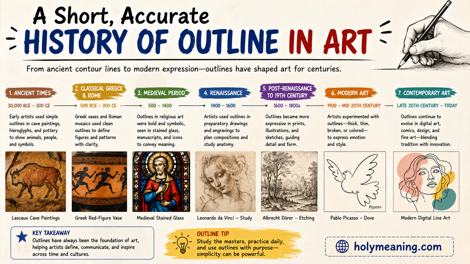
Outline has been a core part of visual art since long before anyone had a word for “art” at all. Here’s a condensed, historically grounded look at how it evolved.
Prehistoric cave painting already shows a clear grasp of outline as a tool. The animal figures found at sites like Lascaux and Chauvet in France use confident, continuous outlined forms, often layered or repeated to suggest movement — an early, instinctive version of the same line techniques artists use today to imply motion and energy.
Ancient Egyptian art turned outline into a formal, almost rigid visual language. Figures were drawn with strong, stylized contour lines specifically to maximize legibility and symbolic clarity rather than realism. The goal wasn’t to show what a person actually looked like from a natural viewpoint; it was to represent them in the clearest, most recognizable way possible, using consistent outline conventions passed down for centuries.
Ancient Greek pottery pushed outline even further into the spotlight. Black-figure and red-figure techniques relied on outline as essentially the entire visual system — figures were built almost entirely from silhouette and line, since there was no full-color painting involved. Outline wasn’t a supporting technique here; it was the art form.
The Renaissance brought a genuine philosophical debate into the mix, one that’s still referenced in art theory today: the tension between disegno and colore. Florentine artists and theorists championed disegno — drawing and line — as the intellectual foundation of a great artwork, arguing that a strong outline and structural drawing mattered more than color. Venetian painters, Titian chief among them, pushed back hard, building form primarily through color and soft value transitions instead, often minimizing or eliminating hard outline altogether. This wasn’t a minor stylistic quirk; it shaped two entirely different schools of European painting for generations.
By the time of the Post-Impressionist movement, outline made a dramatic comeback, this time as an expressive tool rather than a technical necessity. Vincent van Gogh frequently outlined forms with visible, energetic brushwork. Paul Gauguin and the Cloisonnism movement he helped popularize took things further, using bold, dark outlines to divide flat areas of color, similar in effect to the metal strips separating panels of colored glass in a stained-glass window. This approach directly influenced the graphic, flat-color style that would later define comic art and Pop Art in the 20th century.
Artists Who Made Outline the Point, Not Just the Edge
Some famous artists didn’t just use outline as a technical necessity. They made it central to their entire visual identity. Here are six notable artists and influential artists whose work is genuinely worth studying if you want to understand outline’s full creative range.
Katsushika Hokusai (1760–1849)
Hokusai worked primarily in ukiyo-e, Japanese woodblock printing, a medium where outline wasn’t optional — it was the very first step of production. The carved line came first on the woodblock, and color was added afterward in separate printing passes. His famous work The Great Wave off Kanagawa relies on bold, confident outline to organize an incredibly dynamic, chaotic composition into something instantly readable.
Aubrey Beardsley (1872–1898)
Beardsley worked almost entirely in stark black-and-white ink illustration, and because he had no shading or color to fall back on, outline had to carry all of the tonal and emotional weight in his work. His flowing, almost whip-like lines became a defining visual signature of the Art Nouveau movement, influencing illustration styles for decades after his death at just 25 years old.
Egon Schiele (1890–1918)
Schiele’s outline work is jagged, broken, and often deliberately uncomfortable to look at, which was entirely the point. Rather than using contour to describe anatomy accurately, he used it to convey psychological tension and rawness. His figures often look distorted and angular precisely because the line itself was doing emotional work, not anatomical work.
Roy Lichtenstein (1923–1997)
Lichtenstein borrowed his signature thick black outline directly from mid-century commercial comic printing, combining it with the Ben-Day dot printing technique used in cheap newspaper comics at the time. What was once considered a purely commercial, disposable visual style became one of the defining looks of the Pop Art movement, and his outline-heavy paintings now sell for tens of millions of dollars at auction.
Jean-Michel Basquiat (1960–1988)
Basquiat’s outline work is intentionally raw, repeated, and unpolished, standing in sharp contrast to academic, carefully rendered line work. His use of scratchy, layered, and repeated outline lines was a deliberate rejection of traditional fine-art polish, treating line as urgency and immediacy rather than technical precision.
Bill Sienkiewicz (b. 1958)
A modern comic artist worth knowing if you assume comics always mean clean, uniform outline. Sienkiewicz frequently abandons traditional line-based inking altogether in favor of mixed media, painted textures, and torn-paper collage effects, letting outline break down completely in places. His work is a useful reminder that even in a medium built around linework, outline is always a choice, never a requirement.
Artist quick-reference table:
| Artist | Years | Signature Outline Style |
|---|---|---|
| Katsushika Hokusai | 1760–1849 | Bold woodblock-carved contour |
| Aubrey Beardsley | 1872–1898 | Flowing black-and-white ink line |
| Egon Schiele | 1890–1918 | Jagged, emotionally distorted contour |
| Roy Lichtenstein | 1923–1997 | Thick, comic-derived Pop Art outline |
| Jean-Michel Basquiat | 1960–1988 | Raw, repeated, deliberately unpolished line |
| Bill Sienkiewicz | b. 1958 | Mixed-media, outline-breaking texture |
Outline in Applied and Commercial Design
Fine art and gallery paintings aren’t the only place outline shows up. It’s arguably even more important in commercial and applied design, where clarity and functionality often matter more than expression.
Logo Design
Outline-only logos tend to scale and reproduce far better than fully filled or shaded ones, especially at small sizes or in single-color print applications like embroidery, engraving, or newspaper ads. A clean vector art outline logo will hold its shape whether it’s printed on a business card or blown up on a billboard, which is exactly why so many modern brand identities lean toward simplified, line-based marks.
Tattoo Art
In tattooing, outline is quite literally the skeleton of the entire piece. Because fine detail and thin lines tend to blur and spread as skin ages, tattoo artists rely on bold, confident outline work to make sure a design still reads clearly ten or twenty years down the road. Shading and color inside that outline can fade or shift over time, but a well-executed bold line tends to hold its structure the longest.
Animation
Traditional animation involves a process called “line boil,” referring to the tiny, natural variations in outline from frame to frame when each drawing is done slightly differently by hand. Studios spend enormous effort on clean-up passes specifically to control how consistent — or intentionally inconsistent — that outline stays across a sequence, since even small line jitters affect how smooth or “alive” a character’s movement feels to the viewer.
Medical and Scientific Illustration
This is arguably the field where outline is used in its most purely functional form. Medical illustrators rely on precise, consistent line work specifically because clarity and reproducibility matter more than expression or style. A textbook diagram of human anatomy needs its outline to communicate information accurately above everything else.
Graphic Novels and Comics
In traditional comic book production, inking (adding the final outline over a penciled drawing) is treated as its own distinct professional skill, separate from penciling. An inker isn’t just tracing someone else’s pencil lines — they’re making real decisions about line weight, which lines to keep, which to drop, and how to translate a soft graphite sketch into confident, printable outline drawing. Many legendary comic art teams are remembered specifically for their penciller-inker pairing, since the inker’s outline choices genuinely shape the final look of the finished page.
Common Outline Mistakes (and What’s Actually Going Wrong)
If your drawings feel flat or stiff, there’s a good chance one of these outline habits is the culprit.
- Uniform line weight on every single edge. When every outline in a drawing is exactly the same thickness, the whole piece reads as flat, because there’s no visual cue telling the eye what’s close, what’s far, or what’s in shadow.
- Outlining internal details that should be value instead. Beginners often draw a hard line around every fold, shadow, and highlight rather than letting some of that information come through shading. This tends to make a drawing look more like a coloring book page than a finished piece.
- Treating outline and shading as two unrelated steps. Outline and value work together. A confident line drawing that gets shaded as an afterthought rarely looks as integrated as one where the artist planned both from the start.
- Ignoring implied line entirely. Some artists draw every single edge with a hard outline out of habit, even in areas where a softer, lost edge would create more depth and realism.
- Inconsistent pressure with pen or ink. Nervous, shaky pressure control tends to produce uneven, unintentional-looking line weight, rather than the deliberate variation skilled inkers use on purpose.
How to Actually Get Better at This
Understanding outline meaning in art intellectually is one thing. Building the actual hand skill is another. Here’s a practical path forward.
Daily Exercises
- Blind contour drawing for five to ten minutes a day, using your own hand, a houseplant, or any object nearby
- Timed gesture drawing, aiming for 30 to 60 seconds per pose, focusing purely on capturing overall shape and movement
- Single continuous line drawings, where you never lift your pen or pencil off the page for the entire piece
Deliberate Skill Drills
- Line-weight ladders: draw the same simple edge five times, using five clearly different pressure levels, to build muscle memory for controlled variation
- Double-pass studies: draw a photo reference once using outline only, then draw it again using implied line and value only, no hard edges at all, to feel the difference between the two approaches directly
- Edge-mapping exercises: take a reference photo and physically mark which edges are hard, which are soft, and which disappear entirely, before you draw a single line
Study Recommendations
- Betty Edwards, Drawing on the Right Side of the Brain — the definitive resource for observational and contour drawing exercises
- Andrew Loomis, various instructional books — excellent for classical form and structural line control, still widely used by illustrators today
- Any solid comic inking tutorial or resource focused specifically on line weight and confident, expressive outline techniques
Tools Worth Trying
- Fixed-width technical pens (like the Micron line) for building confidence and consistency
- A flexible dip pen or brush pen for practicing genuine pressure-based line weight variation
- A basic drawing tablet, if you want to explore digital art outline work without committing to expensive equipment right away
Real-World Outline Examples You’ll Recognize
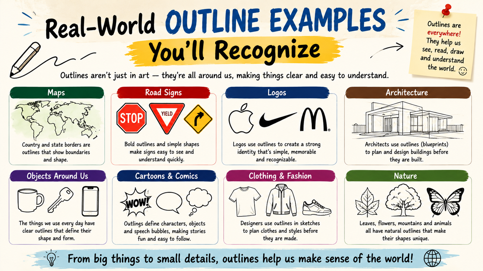
To bring this full circle, here’s a quick rundown of where these concepts show up in everyday visual culture, all pulled from sections above:
| Application | Why Outline Matters There |
|---|---|
| Tattoo art | Bold lines hold their structure as skin ages |
| Logo design | Simplified outline scales cleanly at any size |
| Animation | Outline consistency affects perceived smoothness of motion |
| Medical illustration | Precision and clarity outrank stylistic expression |
| Street murals | Bold outline reads clearly from a distance |
| Graphic novels | Inking is a distinct professional skill shaping the final art |
The Line That Holds Everything Together
Outline isn’t just the edge of a shape, and it never really was. It’s a decision an artist makes, again and again, about what to show clearly, what to leave soft or implied, and how much weight to give any single line. Hokusai carved it into wood. Schiele bent it into something uncomfortable and human. Lichtenstein borrowed it from newsprint and turned it into fine art worth millions.
Whether you’re sketching in a notebook, inking a comic page, or building a scalable logo in vector software, the same underlying question applies every time: how confident, how thick, how present should this line be? Get comfortable answering that question on purpose instead of by habit, and your drawing will start to look less like a copy of reality and more like a genuine artistic choice.
FAQs
What’s the difference between an outline and a sketch?
An outline defines a form’s outer edge with a clean line. A sketch is a rougher, exploratory drawing that may include shading, proportions, and multiple corrections.
Do professional illustrators still draw outlines by hand before going digital?
Many do, sketching on paper or a tablet first, then refining the linework digitally on separate vector or raster layers for cleaner control.
Is outline drawing still taught in art schools today?
Yes. Foundational courses still rely heavily on contour and blind contour exercises to build observational accuracy before students move to shading and color.
Which digital art programs are best for clean vector outlines?
Adobe Illustrator, Affinity Designer, and Procreate (with vector-style brushes) remain the most widely used tools for precise, scalable outline work.
Can AI art tools replicate an artist’s unique outline style?
AI tools can approximate line weight and style patterns from training data, but they can’t replicate the deliberate, context-driven choices a human artist makes edge by edge.
conclusion
Understanding outline meaning in art changes how you see every drawing. It’s not just a line around a shape. It’s a choice about weight, edge, and emphasis. Artists use it to guide the eye and shape emotion. Once you notice it, you can’t unsee it.
Keep practicing outline meaning in art through daily sketches and contour drills. Study the masters. Try digital tools too. Small changes in line weight make a big difference. Over time, your lines will feel more confident and alive. That’s the real power of outline meaning in art.